
Goldilocks Meets Geopolitics
What My Chart Pack Says About Where We Are and Where We’re Going

Volatility has returned. The macro backdrop was healthy. Credit is whispering a warning. This is how to think about it.
This weekend I was building my weekly chart pack when the world changed. On February 28th, U.S. and Israeli forces launched coordinated strikes on Iran. By Monday morning, the Strait of Hormuz was functionally closed, oil was surging, and the VIX had spiked above 23.
The S&P 500 sold off as much as 2.5% intraday before recovering to close down around 1%. The headlines screamed about war, oil shocks, and the death of the soft landing. YouTube thumbnails went from green to red overnight.
I’ve seen this movie before. So have you.
What I want to do in this post is something different from what you’ll find on financial media. I want to lay out the weight of evidence from my chart pack and walk you through what the data actually says. Not what the narratives say. Not what the fear says. The data.
Some of what I’m about to show you is bullish. Some of it is not. The honest read is more complex than either the “buy the dip” crowd or the “this is the big one” crowd wants to admit.
I’ll start with what we knew before the bombs dropped, then layer in what’s changed.
The Macro Regime: Textbook Goldilocks
Before I get into the market data, I want to establish the macro backdrop. This context matters because geopolitical shocks are processed differently depending on the underlying health of the economy.
Figure 1 is my Leading Macro Compass. It plots two impulses against each other: the growth impulse (ISM New Orders, x-axis) and the inflation impulse (Truflation year-over-year, y-axis). The four quadrants map to the macro regimes investors care about: Stagflation, Reflation, Goldilocks, and Deflation. The Truflation axis reflects current real-time data. The ISM axis uses February’s New Orders reading of 55.8, which was collected before the Iran strikes but is the most recent available.
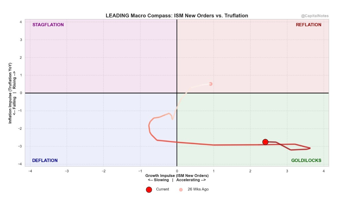
The current reading (dark red dot) sits deep in the Goldilocks quadrant: growth accelerating, inflation falling. Six months ago (the pink dot), we were in Reflation territory: growth was positive but inflation was still sticky. Over the following months, the path migrated left and down through the Deflation quadrant as growth slowed and prices began falling. Then, as ISM New Orders recovered and Truflation collapsed, the reading crossed right into Goldilocks, where it sits today.
That trajectory tells a story all by itself. It’s the path of an economy that went through a soft patch and came out the other side with growth re-accelerating and inflation falling. Textbook.
The latest ISM Manufacturing data (the one data set in this analysis collected before the Iran strikes) confirms the growth side of this picture. The February PMI printed at 52.4, the second straight month of expansion and only the third expansion reading in 40 months. New Orders came in at 55.8, down slightly from January’s 57.1 but still well above the 50 expansion threshold. Of the six largest manufacturing industries, four reported increased new orders.
In other words, the real economy was accelerating heading into this event. That matters.
The Inflation Picture: A Tale of Two Data Sets
Now things get interesting, and where I need to be honest about competing signals.
Figure 2 is one of my favorite charts. It shows the lead/lag relationship between Truflation (a real-time inflation gauge that aggregates over 35 million data points daily from sources like Amazon, Walmart, and Zillow) and the official CPI. This is live data, current as of today.
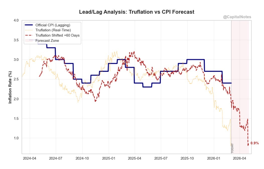
Truflation has collapsed to approximately 0.9% as of today. Some readings in early February hit as low as 0.68%. When I shift this series forward 60 days, the model suggests CPI could fall well below 2% in the months ahead, potentially approaching levels we haven’t seen since the pre-pandemic era.
Official CPI is still printing near 2.4%. In my opinion, that gap is about to close. The primary driver is shelter costs: Truflation weights housing closer to 25% of its index versus the BLS at roughly 33%, and it captures real-time price / rent declines and mortgage rate changes that the BLS’s “Owner’s Equivalent Rent” methodology lags by months.
Now for the “however” that I think too many deflation bulls (including me) need to take seriously.
The ISM Prices Paid index surged 11.5 points to 70.5 in February (reported March 2, based on survey data collected before the Iran strikes), the highest reading since June 2022. This is not a small move. All six of the largest manufacturing industries reported higher input prices. The culprits are steel, aluminum, and the new Section 122 global tariffs that went into effect in late February. ISM Chair Susan Spence said she would not be surprised to see further increases in March.
Historically, readings above 70 in the ISM Prices Paid index have been associated with CPI increases three to six months down the line.
So which is it? Is Truflation right that consumer-level inflation is collapsing today? Or is the ISM Prices Paid index right that pipeline inflation was already building before the first missile was fired?
I think both can be simultaneously true, and understanding why is critical. Truflation measures consumer-facing prices in real time: what you pay at Walmart, what rents are doing, what your insurance costs. ISM Prices Paid measures what manufacturers are paying for raw inputs. There is a transmission lag between the two. Input cost increases take time to reach consumers, and some of them get absorbed by corporate margins rather than passed through.
The risk scenario is that the Truflation signal is correct about where we are right now (consumer inflation falling), while the ISM Prices Paid signal is correct about where we might be heading (pipeline pressure building). Add an oil shock on top of tariff-driven input cost increases, and you have a plausible path toward re-acceleration of consumer prices in the second half of 2026. Keep in mind: the ISM Prices Paid reading of 70.5 was collected before the Iran strikes and the resulting oil price surge. The March reading could be even worse.
I’m not predicting that outcome. But I’m not dismissing it either. Investors needs to hold both of these data points in mind simultaneously.
Market Breadth: The Foundation Is Strong
With the macro backdrop established, let’s look at what the market’s internal health is telling us right now, after the geopolitical shock.
Figure 3 shows the percentage of equal-weight sectors trading above their 10-week moving average as of today’s close. This is a breadth measure that tells us whether the rally is broad-based or concentrated in a handful of names.
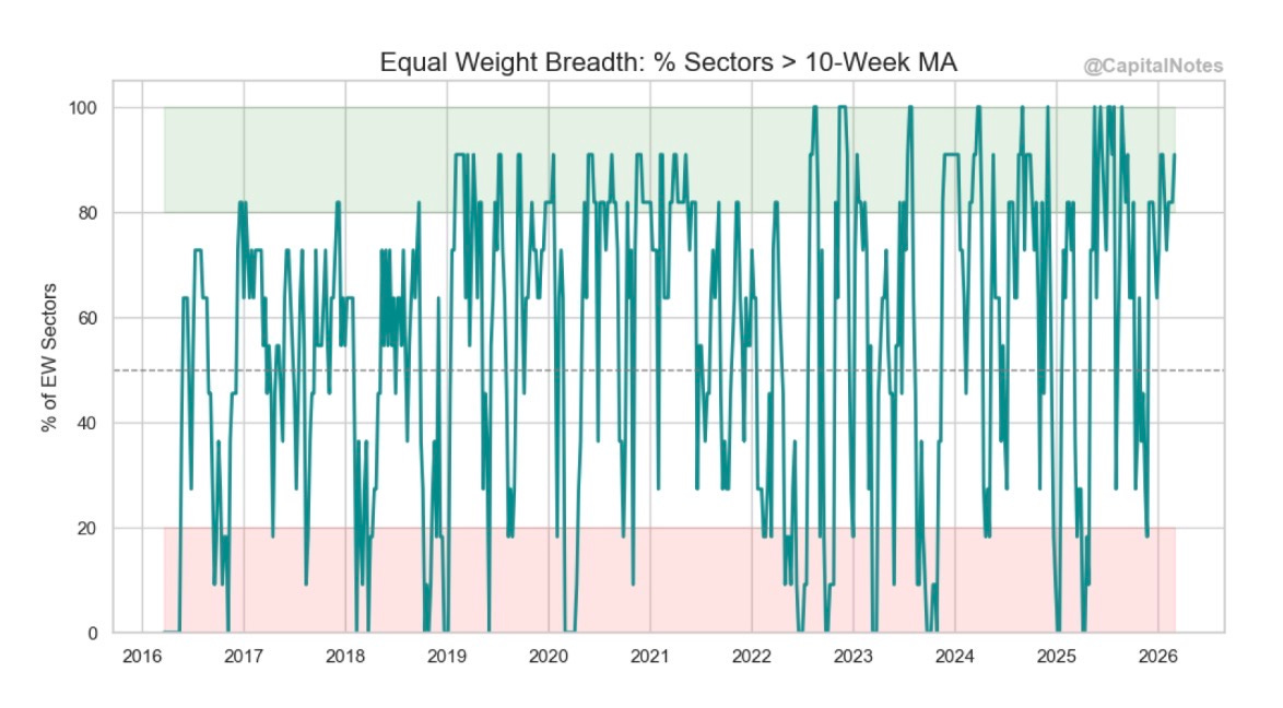
Even after the Iran strikes and this week’s volatility, over 90% of sectors remain above their 10-week MA. That is healthy. It’s the opposite of what we saw in late 2021 (when breadth deteriorated months before the 2022 bear market began) or in mid-2024 when the rally was increasingly concentrated in mega-cap tech. The market absorbed a geopolitical shock and breadth didn’t crack.
Figure 4 zooms out to the 40-week moving average, which captures the structural trend.
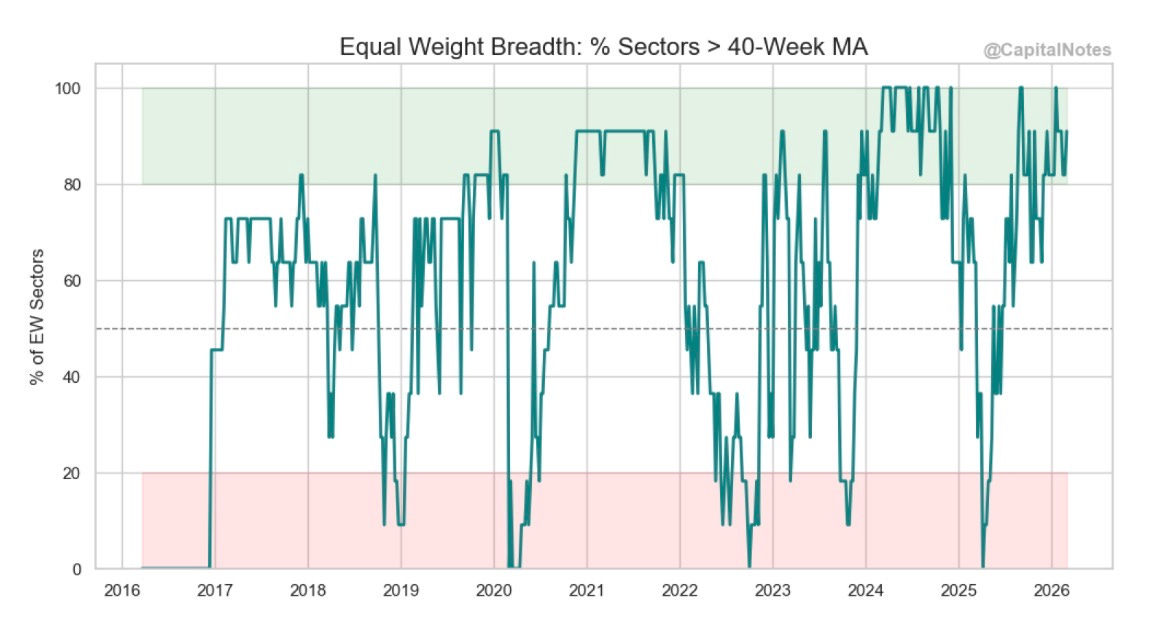
Same story. Roughly 90% of sectors remain above their 40-week MA. Compare that to early 2022 or late 2024 when this measure was deteriorating well before prices rolled over.
Why does this matter? Because breadth divergences are what kill bull markets. When prices make new highs while fewer and fewer sectors participate, it signals that the advance is fragile. Despite the shock, that condition has not developed. The foundation remains broad.
Figure 5 shows the “Underwater” plot and the equal-weight sector drawdown map, current as of today’s close.
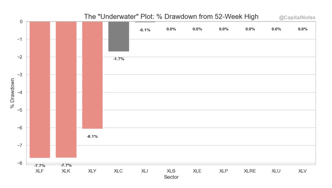
The drawdown data confirms that the damage remains concentrated, not systemic. Financials (XLF) and Technology (XLK) are the deepest underwater at -7.7% each from their 52-week highs. Consumer Discretionary (XLY) is down 6.1%. But 7 out of 11 sectors are sitting at or within 0.1% of their highs. The equal-weight drawdown map tells the same story: XLF at -3.9%, XLK at -1.4%, and XLY at -1.4% are the outliers. Most sectors are at 0.0%.
Even after the geopolitical shock, the weakness is idiosyncratic (tech valuation compression, financial sector concerns) rather than macro-driven. That’s an important distinction.
If you’re finding value in this analysis, please like, subscribe, and share. Your readership is much appreciated.
Volatility: Panic Gauges at the Threshold
Now let’s talk about what volatility looks like right now.
Figure 6 shows the S&P 500 Volatility Term Structure: the ratio of VIX (30-day volatility) to VXV (3-month volatility), current as of today’s close.
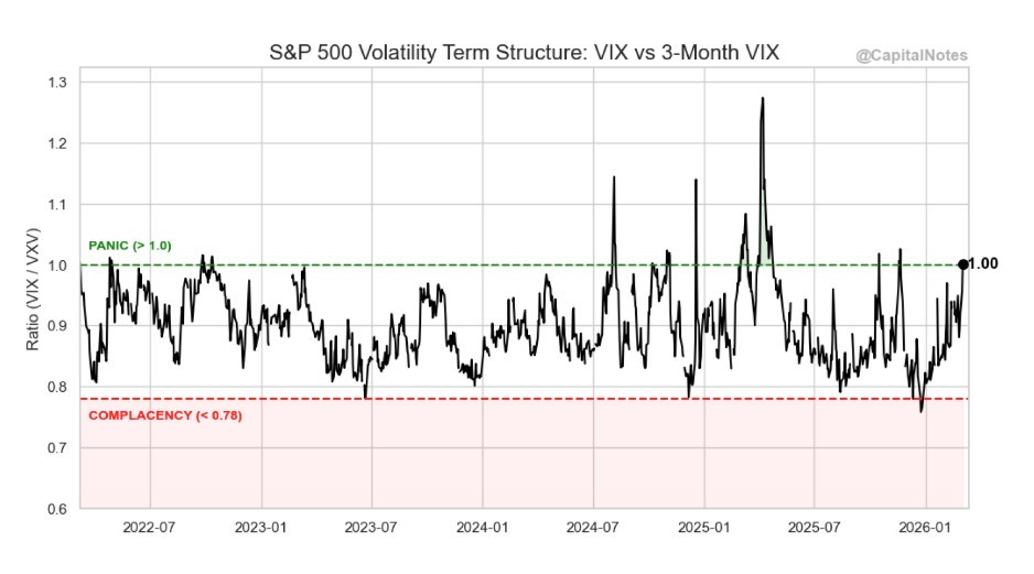
The ratio just hit 1.00, right at the panic threshold. Under normal conditions, this ratio trades below 1.0 because longer-dated volatility carries a premium (the term structure is in contango). When the ratio inverts to 1.0 or above, it means short-term fear has exceeded longer-term expectations. The VIX spiked to around 23-26 on Monday’s session.
Historically, readings at or above 1.0 on this ratio have coincided with tradeable bottoms. Not always. But the base rate favors buyers at these levels, not sellers.
Figure 7 provides a second volatility lens: the “Flash Crash” Gauge measuring the VIX9D (9-day volatility) relative to the standard VIX (30-day).
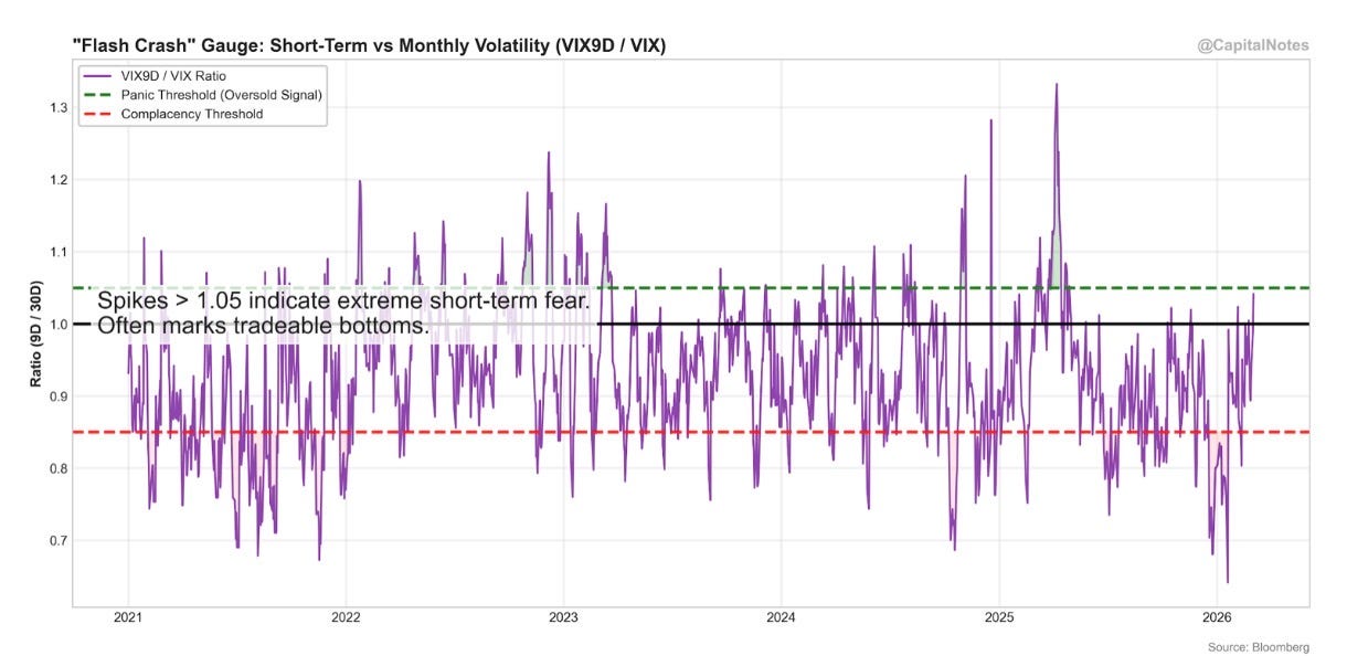
Spikes above 1.05 indicate extreme short-term panic. The chart’s own annotation notes that these readings “often mark tradeable bottoms.” We’re right at that zone. The pattern is clear across 2021 through 2026: sharp spikes in this ratio have consistently marked short-term fear extremes that preceded recoveries, not the beginning of extended declines.
Two independent volatility measures, using different timeframes, telling the same story. The crowd is panicking in the short term.
Credit Markets: The Honest, Complicated Read
This section is the most important in the entire post. I could have cherry-picked the bullish read here and moved on. But that wouldn’t be honest, and it wouldn’t serve you.
I’m going to show you two charts that measure credit market health in different ways. They tell different stories. Both are valid. Together, they paint a picture that requires nuance.
Figure 8 is the Normalized Stress Gauge, which plots the VIX (equity volatility, blue) against High Yield OAS (credit spreads, red) on a normalized 0-100 scale.
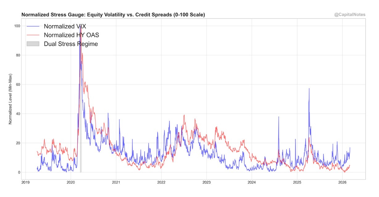
In absolute terms, the VIX has spiked while HY OAS remains relatively subdued. Look at early 2020 or early 2025 for comparison: both measures exploded simultaneously during COVID and “Liberation Day”. That was a genuine systemic crisis. In 2022, both were elevated together during the Fed’s aggressive tightening cycle. Today, the VIX is spiking alone.
On its own, this would suggest the current episode is a sentiment-driven event (geopolitical fear) rather than a fundamental credit deterioration. Credit spreads are still near historically tight levels. The smart money in credit has not panicked.
Now look at Figure 9. This is where it gets complicated.
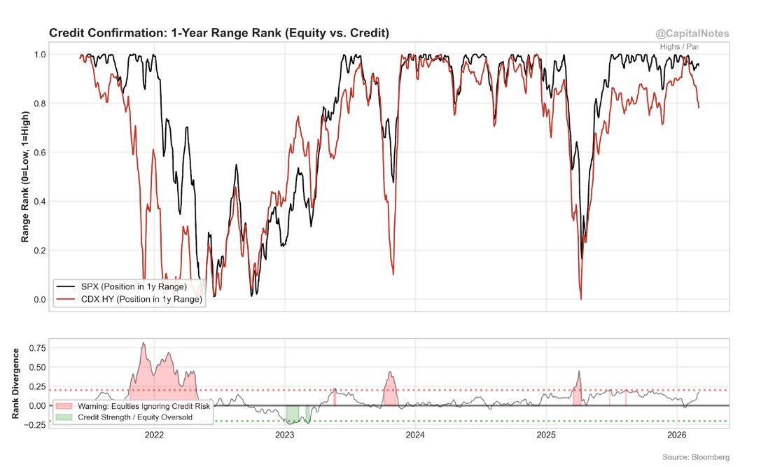
This chart tracks where the S&P 500 and CDX High Yield index each sit within their trailing 1-year range. A reading of 1.0 means at the top of the range (highs for equities, par/tight for credit). A reading of 0 means at the bottom.
Notice the divergence that has been building. The SPX (black line) is holding near the top of its 1-year range, roughly 0.90-0.95. But the CDX HY (red line) has been declining sharply and is now considerably lower. Credit is weakening while equities hold firm.
The bottom panel is the key. It measures the rank divergence between equities and credit. The red dotted line at 0.25 marks the warning threshold: above this level, equities are ignoring credit risk. We’re approaching that line.
Look at the precedents. In 2022, this divergence exploded above 0.75 before equities finally caught down to what credit had been warning. In early-2025, a smaller divergence above 0.25 also preceded a correction. These are not minor episodes.
So the honest read is this: HY spreads in absolute terms remain low, which is why the Stress Gauge (Figure 8) doesn’t look alarming. But the direction of travel in credit relative to equities is deteriorating (Figure 9), and the divergence is approaching a level that has historically preceded equity weakness. These two measures are capturing different things. One is level, the other is trajectory. Both matter.
Whether this credit deterioration is driven by private credit concerns (the private credit market has swelled to nearly $1.4 trillion, rivaling the HY bond market), geopolitical risk repricing, or something else, the signal is the same: credit is whispering something that equity investors haven’t fully processed yet.
I’m not predicting a repeat of 2020 or 2022. However, this is the chart I’ll be watching most closely in the weeks ahead. If the divergence resolves to the upside (credit strengthens back toward equities), it’s a bullish confirmation. If equities catch down to credit, we’ll be glad we were paying attention.
Where the Opportunity Is: Sector Rotation
With the risks acknowledged, let’s talk about where the weight of evidence points for prepared investors. All of the following charts reflect current data as of Tuesday’s close (3/3/2026).
Figure 10 is my Sector Action Quadrant. It plots relative valuation (x-axis, Z-score) against 3-month relative price momentum (y-axis).
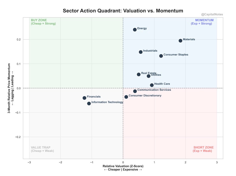
The four quadrants tell you different things about each sector:
The upper right (Momentum) quadrant contains sectors that are expensive and strong: Energy and Materials sit here, benefiting from the commodity and geopolitical backdrop.
The upper left (Buy Zone) is where you find cheap sectors with strong momentum: the ideal combination. Nothing sits squarely here at the moment.
The lower left (Value Trap) is cheap and weak: dangerous. Nothing is deep in this zone either, which is a good sign.
The lower right (Short Zone) is expensive and weak. Communication Services and Consumer Discretionary are edging toward this area.
The sectors that catch my eye are Information Technology and Financials. Both sit in the left half of the chart (cheap relative valuations) with lagging momentum. That’s a contrarian setup.
Let me show you why.
Figure 11 is the Information Technology relative valuation Z-score versus the S&P 500 going back to 2017.
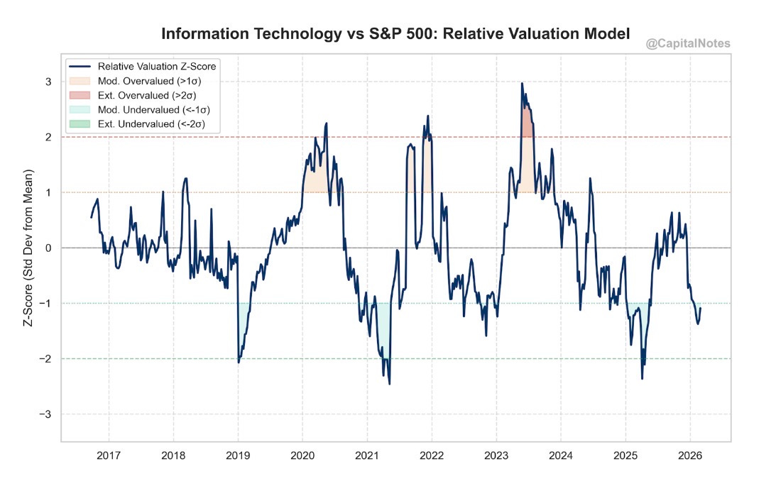
Tech’s relative valuation has compressed from +3σ in mid 2023 (extreme overvaluation) to nearly -1σ today (moderately undervalued). The last time Tech was this cheap relative to the broad market was during the “Liberation Day” sell off of 2025, just before the sector ripped higher.
I’m not predicting a repeat. The circumstances are different. But the valuation setup is rhyming, and that rhyme is worth noting.
Figure 12 tells an even more striking story for Financials.
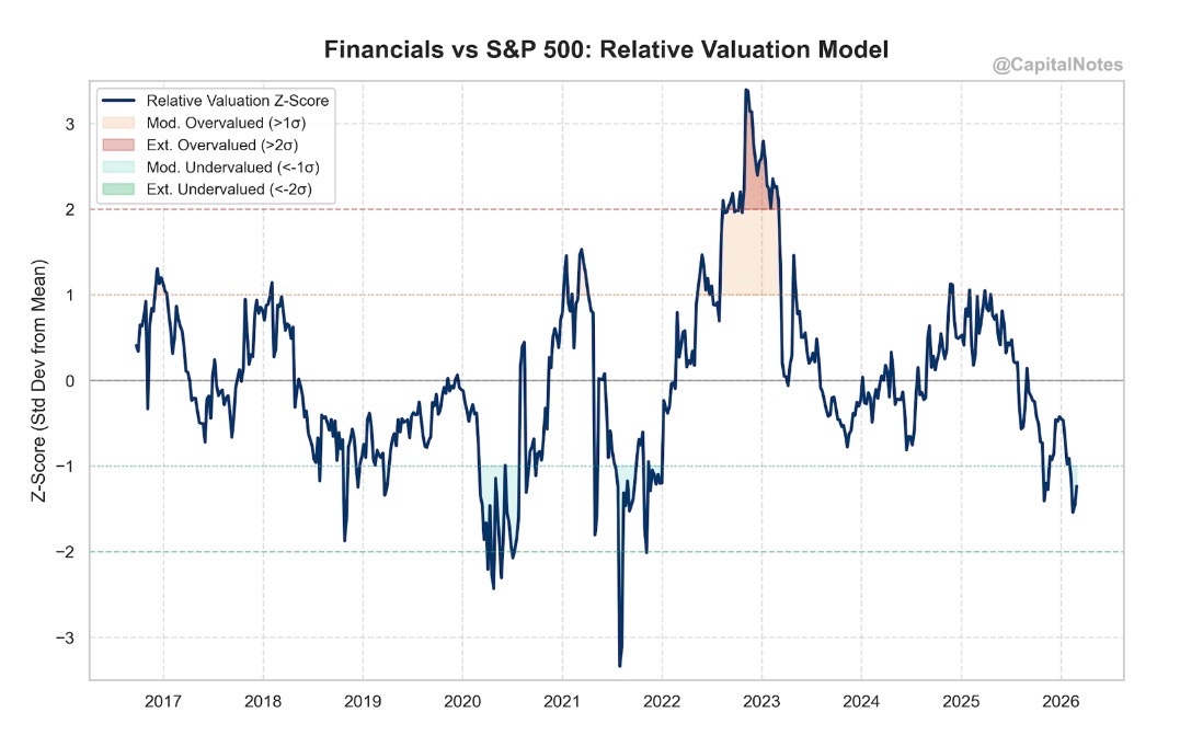
Financials were approaching -1.5σ on the relative valuation model. That puts them near their cheapest levels versus the S&P 500 since early-2022 and the 2020 COVID crash. The geopolitical selloff and the credit deterioration I flagged earlier have only deepened this discount.
Now, I want to connect this back to the credit discussion. Financials are cheap partly because the market is pricing in credit risk. If the credit divergence I showed you in Figure 9 worsens, Financials could get cheaper still. But if it resolves favorably, these valuations represent a meaningful opportunity. Position sizing and selectivity matter here more than usual.
The Fed Backdrop: Rates and the Oil Wrinkle
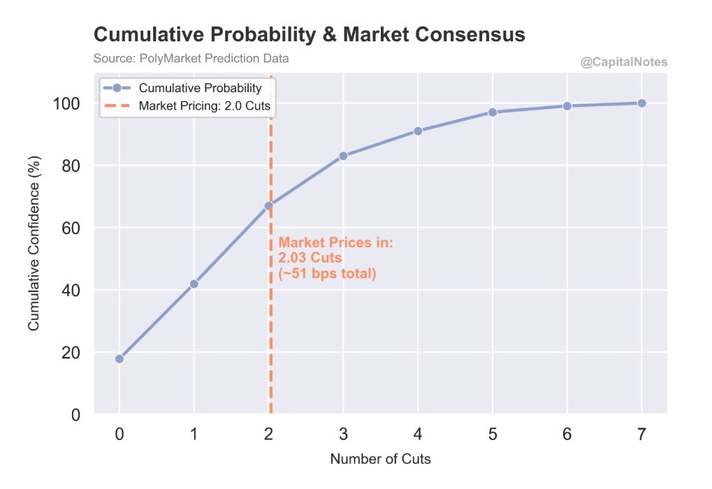
Figure 13 shows the market-implied probability distribution for Fed rate cuts in 2026, sourced from Polymarket prediction data as of today. This is important: these probabilities already reflect the Iran shock and the ISM Prices Paid surge. The market has digested both events and is still pricing in cuts.
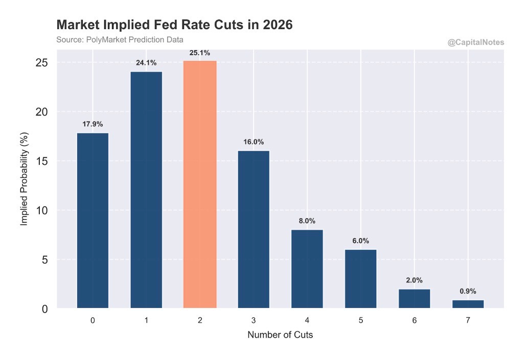
The distribution peaks at 2 cuts (25.1% probability), with 1 cut close behind (24.1%) and 0 cuts at 17.9%. The cumulative probability chart (Figure 14) shows the market pricing in approximately 2.03 cuts total, or roughly 51 basis points.
This is where the competing inflation signals I discussed earlier become directly actionable.
If the Truflation thesis is correct and consumer-facing CPI continues to fall toward 1%, the market is likely underpricing the number of cuts. The Fed would have significant room to ease.
But the ISM Prices Paid surge to 70.5 (pre-Iran shock) and the geopolitical oil shock introduce a real complication. The Fed is watching input costs and energy prices. If oil stays elevated due to a prolonged Strait of Hormuz disruption, it will create near-term inflationary pressure that makes the Fed reluctant to cut, even as the underlying consumer economy may be slowing.
The academic research on oil shocks is instructive here. Studies from the Reserve Bank of Australia and the Dallas Fed have shown that oil supply shocks operate through two competing channels. The cost-push channel drives input prices higher in the near term, feeding inflationary pressure. The demand-pull channel works in the opposite direction: higher energy costs act like a tax on the consumer, diverting spending from discretionary goods, constraining aggregate demand, and ultimately destroying the very demand that sustains economic growth. The last three major U.S. downturns before the pandemic were all preceded by a doubling of oil prices.
The research also shows this effect is state-dependent. During economic booms, the cost-push channel dominates and inflation tends to run hotter. During slowdowns, the demand destruction channel takes over. Where are we right now? Manufacturing is expanding, but barely (52.4 is not a roaring boom). That puts us in a gray zone where both channels are plausible.
The near-term inflation impulse from oil is real. But over a 6-12 month horizon, sustained high energy prices tend to be recessionary and disinflationary as they choke off consumer spending.
In other words: the path to more rate cuts may run through a period of pain first.
The Bottom Line: Risk Master Says Risk On, But With an Asterisk
Figure 15 is the Risk Master Composite, which aggregates multiple risk signals into a single reading.
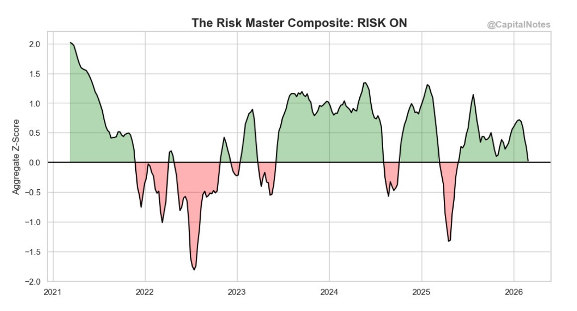
Despite the Iran shock, the composite still sits slightly above 0. That’s positive territory. Risk On.
For context: it hit -1.4 in early 2025 and -1.8 in mid-2022 during the steepest sell off of the bear market. The current reading reflects a market that absorbed a geopolitical shock from a position of structural health.
Conclusion:
This is how I’m reading the weight of evidence.
The bull case remains intact at the macro level. The economy was in Goldilocks territory heading into the Iran strikes. Manufacturing is expanding. New orders are strong. Market breadth remains broad even after the shock, not narrow. Volatility gauges have spiked to levels that historically reward patient buyers. And valuations in key sectors like Tech and Financials have compressed to levels that haven’t been this attractive since the “Liberation Day” sell off.
The risk to monitor is credit. The CDX HY range rank divergence is approaching warning levels. Absolute spreads remain tight, but the direction is wrong. This doesn’t mean sell everything tomorrow. It means be selective. It means pay attention. And it means that if you’re adding risk here, favor sectors and names where the valuation discount already reflects bad news.
The wildcard is the inflation picture. Truflation says consumer prices are falling fast. ISM Prices Paid says input costs are surging. Oil prices add another layer of uncertainty. The resolution of this tension will determine whether the Fed has room to cut aggressively or whether we’re heading into a period of stagflationary crosscurrents.
It’s times like this that investors must remember that future returns are directly related to the price one pays. When there are clouds on the horizon it becomes more important to be selective when deploying additional capital.
Geopolitical shocks and credit stress create fear. Fear creates opportunity. The hard part has always been the same: having the discipline to act when the crowd is panicking.
Let’s see what happens.
— Brant
If you found this analysis useful, please like, subscribe, and share. Your readership is much appreciated.
Disclaimer: The content provided on the Capital Notes newsletter is for general information purposes only. No information, materials, services, and other content provided in this post constitute solicitation, recommendation, endorsement or any financial, investment, or other advice. Seek independent professional consultation in the form of legal, financial, and fiscal advice before making any investment decision. Always perform your own due diligence.