Today I’m going to take a look at a number of charts and provide you with my interpretation for each of them. All of this with the intention of predicting the outcome of Santa’s impending visit.
Presents 🎁 or Coal 🪨?
To start off this chart pack I'd like to take a look at two of my very own custom indicators that help me monitor the overall direction of risk appetite across global markets.
The first, in Figure 1, I call the Offense vs Defense Index. This index measures the relative performance between the cyclical and defensive portions of the equity markets. Essentially, if more capital is flowing into the “offensive” portions of the market this index will rise, pointing to a willingness on the part of investors to take accept higher levels of risk.
It's difficult to be too bearish with the Offensive vs Defense Index recently breaking out of a bullish continuation pattern and currently parked near all-time highs. Do to the nature of intramarket capital flows, this custom index usually turns down ahead of the broader market (see late-2021) and I’m not seeing any indication of that just yet.
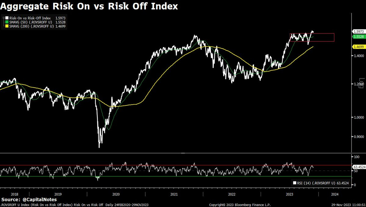
The last chart, Figure 1, was equity only. This Risk On vs Risk Off Index, Figure 2, incorporates data from equity, fixed income, forex, and commodities markets.
The Risk On vs Risk Off Index is also breaking out of a continuation pattern and moving to new highs. Again, this is indicative of capital flowing out of defensive assets and into what are seen as risk assets, on a relative basis.
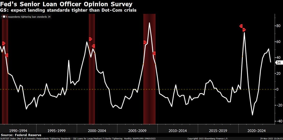
Figure 3 shows the % of banks that are tightening loan standards. This survey appears to have now topped. This is a positive for liquidity conditions moving forward as it should generally become easier, on the margin, for businesses and individuals to qualify for new loans. More lending = more liquidity. More liquidity = higher asset prices, all else equal.
Figure 4 shows a method for projecting the short term direction of manufacturing sector health. New Orders - Inventories (yellow line) are forecasting a continued increase in the manufacturing PMI (white line) over the next 6 months. In fact, the forecast is for PMI to move back above 50, into expansion territory.
Currently, the manufacturing sector and commercial real estate are the laggards on economic growth. This headwind for growth will dissipate should one or both of these sectors stabilize. Figure 4 is suggesting that stabilization is now in progress for manufacturing.
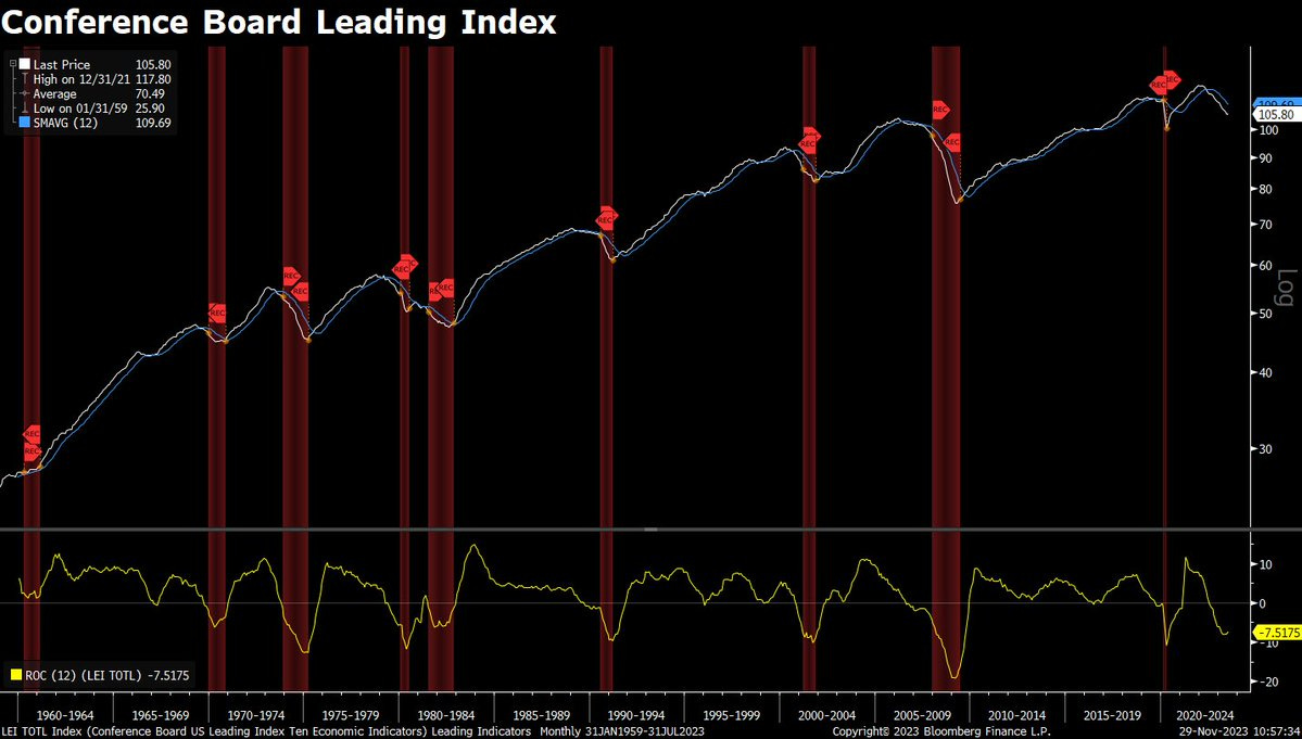
The Conference Board Leading Index, Figure 5, has been negative for quite some time, and has been consistently used by analyst as a reason to be bearish on future economic activity. This includes myself.
However, finance is all about rate of change. The 2nd panel in Figure 5 shows the YoY rate of change in the leading index. This is now bottoming out and turning higher, pointing to marginal improvements in economic activity ahead.
Notice, the leading index tends to do quite well in the years after a major bottom in the YoY rate of change (yellow line), as does real GDP growth and asset prices.
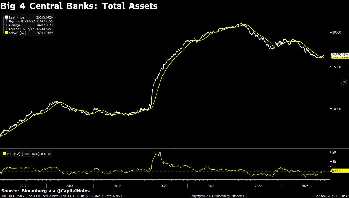
Another positive for global liquidity is displayed in Figure 6.
The Total Assets of the Big 4 Central Banks has turned higher and now crossed above its 52 week moving average, signaling an attempted trend change. Increases in central bank assets, all else equal, is a positive for global liquidity.
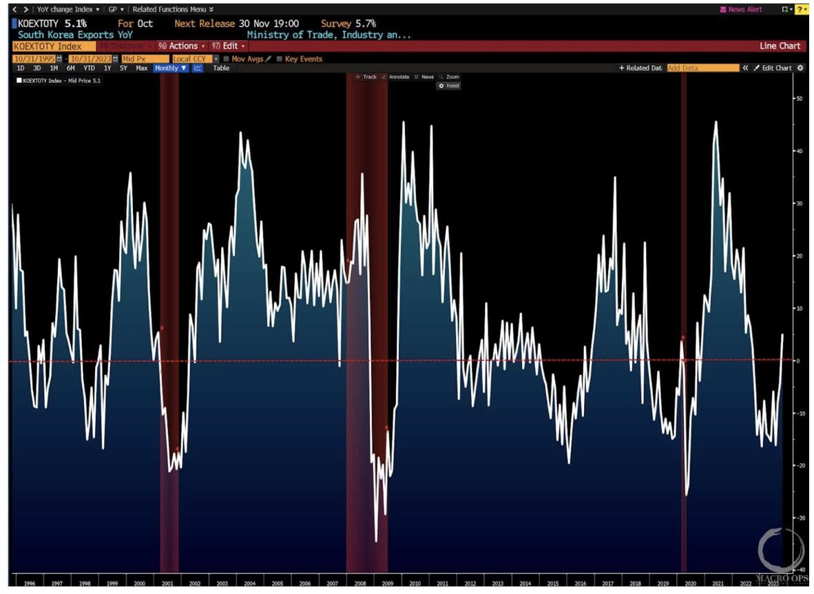
South Korean exports, historically a solid indicator of global growth due to the nature of South Korea’s exports (vehicles, semiconductors, etc), has rapidly turned higher and is now growing again after a period of contraction. H/T @MacroOps for this chart, Figure 7.
Shown in Figure 8, the 7-10 Year Treasury Bond ETF, $IEF, is trying to put in a long term bottom off of a major support level.
When bond prices increase, bond yields decline.
Bonds up = Interest rates down
Lower interest rates are positive for growth, financial conditions, and liquidity.
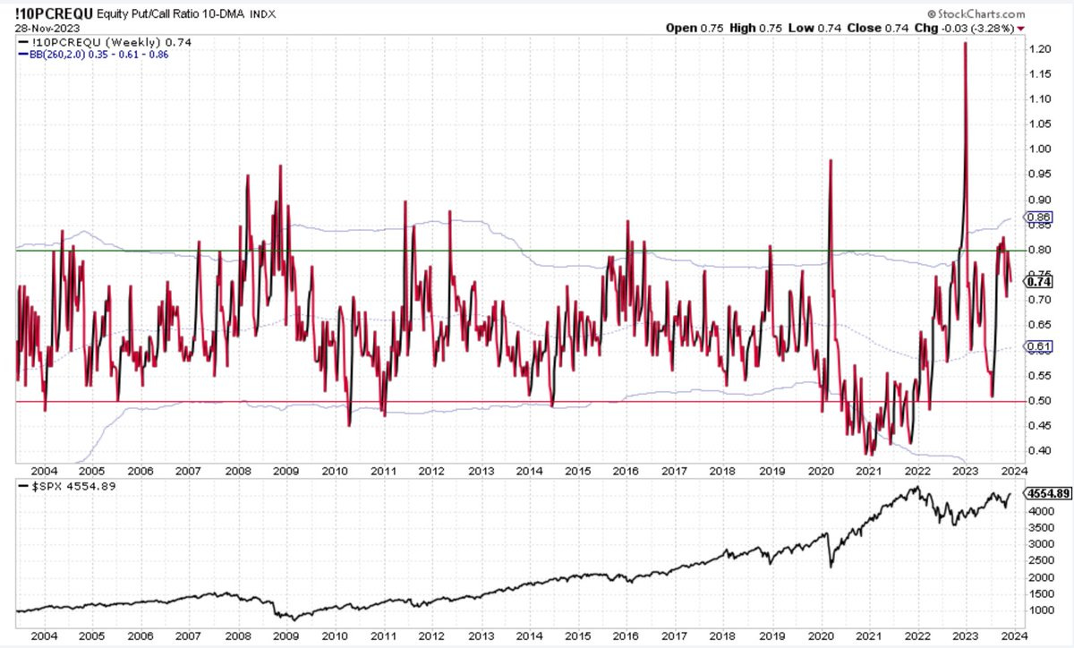
The equity only put / call ratio, Figure 9, remains at levels that are more supportive of a rally in risk assets vs a decline.
In other words, the options market is not yet suggesting any major levels of complacency or over-bullish behavior amongst investors.
Figure 10 shows that corporate bond spreads continue to decline rapidly, breaking to new YTD lows this week.
This is indicative of healthy risk appetite and improving liquidity conditions.
Lastly, Figure 11. Areas of the market traditionally considered synonymous with positive risk appetite are currently breaking out of long-term basing patterns.
Figure 11 shows COIN, Coinbase Global Inc., breaking out from a massive, inverted head and shoulders bottoming pattern. This is also indicative of increasing liquidity and improving financial conditions.
Maybe Santa is planning on bringing us gifts after all.
— Brant
Disclaimer: The content provided on the Capital Notes newsletter is for general information purposes only. No information, materials, services, and other content provided in this post constitute solicitation, recommendation, endorsement or any financial, investment, or other advice. Seek independent professional consultation in the form of legal, financial, and fiscal advice before making any investment decision. Always perform your own due diligence.


